BRAND
What makes smaxh, smaxh
What we believe, how we look, how we talk. Vision, logo, color, type and photography in one place.
VISION
We’re building a simpler, more fun tennis culture, so everyone who plays loves the game even more.
MISSION
smaxh exists to make tennis’s best moments bigger and last longer, by making the hard parts simple.
VALUES
Three things we promise
Simplicity
We take the hassle out of tennis. Finding, booking and splitting costs is the app’s job.
Joy
A great rally or a laugh together. We make the fun on court bigger.
Passion
A little better than yesterday. We cheer on every step of getting better.
4 PRINCIPLES
Four kinds of joy smaxh brings
01
Meeting new hitting partners,
easily
Finding someone at your level is the hardest part of tennis. We match you by experience, level and area.
02
Playing on
a great court
Find a great court nearby and book it right away.
03
Getting better,
fast
See your game objectively and focus on improving.
04
Playing with people
who get you
Play together, grow together.
LOGO
Logo
Our logo is a wordmark. Same shape, same proportions, same colors. Every time.
WHY X
Two circles meant meeting.
X means change.
We started as an app for finding a hitting partner. Our first icon: two circles, two people meeting. In August 2022 we swapped it for an X. Meeting was the start. Changing the game was the point.


01
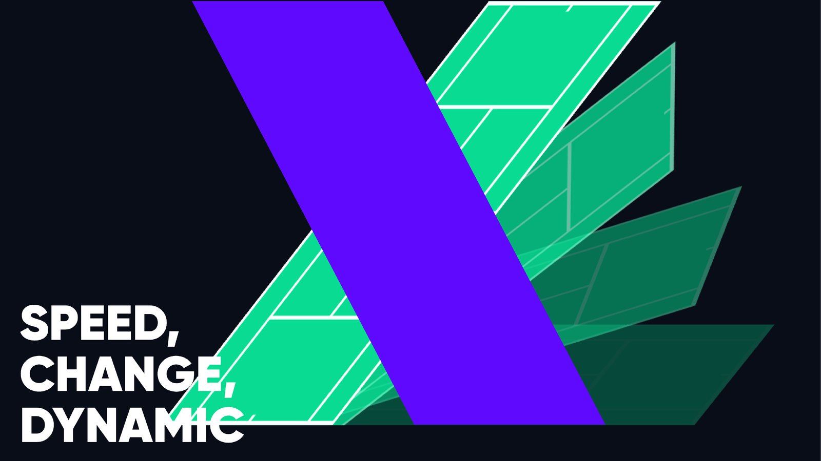
X for change
We set out to turn the old, clunky ways of tennis into something simpler and sharper. The X carries that promise.
02
The moment of the smash
When racket meets ball, the path draws an X. Smash + X. That’s smaxh.
03
X for your limit
In 2023, with our slogan, the X became the joy of breaking limits and getting better.
August 2022 brand explorations · five directions
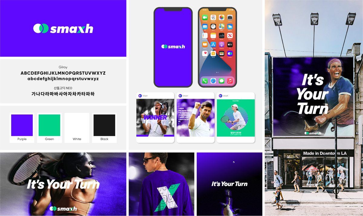
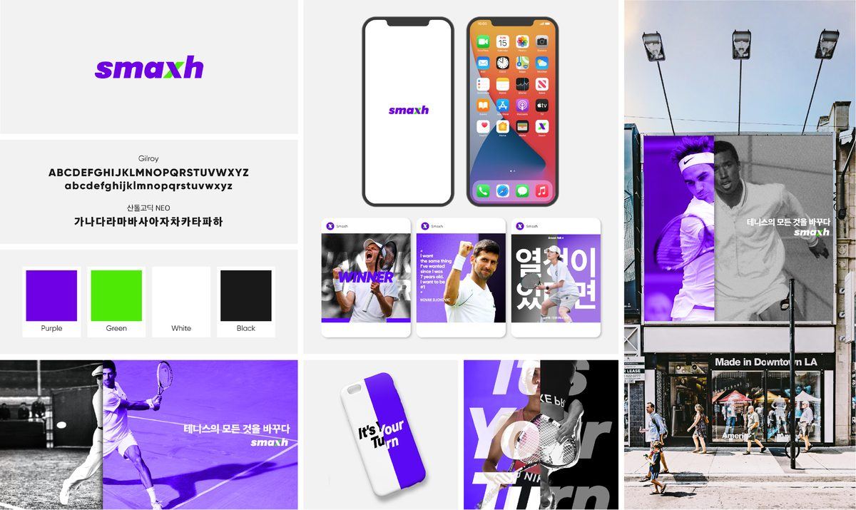
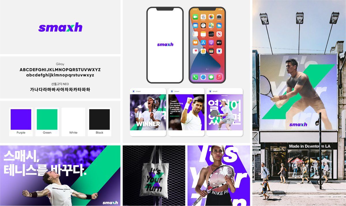
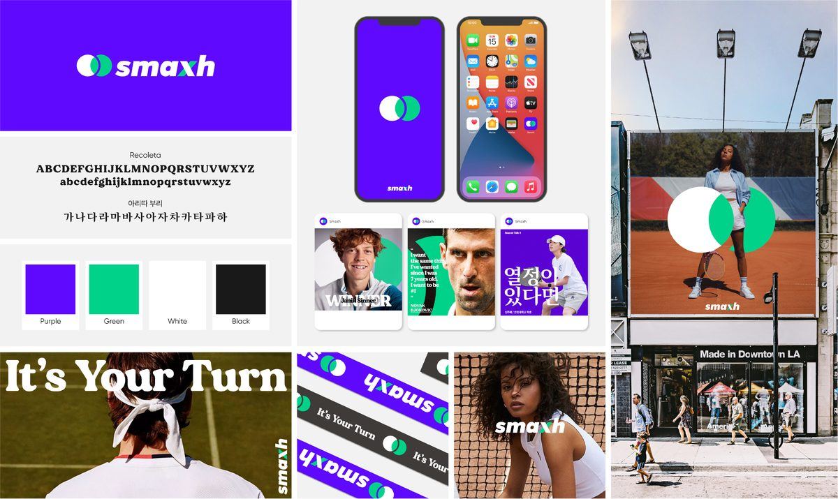
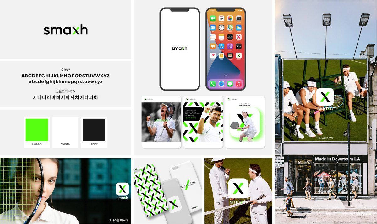
Keep the set clear space (0.3x) around the logo. Never stretch, skew or recolor it.
COLOR
Purple and green
Purple stands for the fun of a purple court. Green is a tennis ball flying past.
SMAXH Purple
HEX #600AFF
RGB 95 / 10 / 255
CMYK 90 / 90 / 0 / 0
Pantone 2140 C
SMAXH Green
HEX #00D28A
RGB 0 / 210 / 138
CMYK 86 / 0 / 60 / 0
Pantone 802 C
Black
HEX #000000
RGB 0 / 0 / 0
CMYK 60 / 40 / 40 / 100
Pantone Black C
White
HEX #FFFFFF
RGB 255 / 255 / 255
We use purple only where an experience begins, like getting the app or joining. Everything else stays black, white and gray.
TYPOGRAPHY
English short and bold, Korean clear
Gilroy · English headlines
Find your court.
Key English headlines use Gilroy Heavy or Black, kept as short as possible. This web page shows Montserrat as a stand-in.
Pretendard · Korean headings and body
테니스를 바꾸다.
Korean uses Pretendard: bold for headings, generous line spacing for body text.
SLOGAN
From It’s Your Turn
to SMASH YOUR LIMIT.
Our first slogan came from our early days of finding partners: now it’s your turn on court. After the X, we matched it to our vision of getting better, and SMASH YOUR LIMIT. was born.


Where you’ll see it

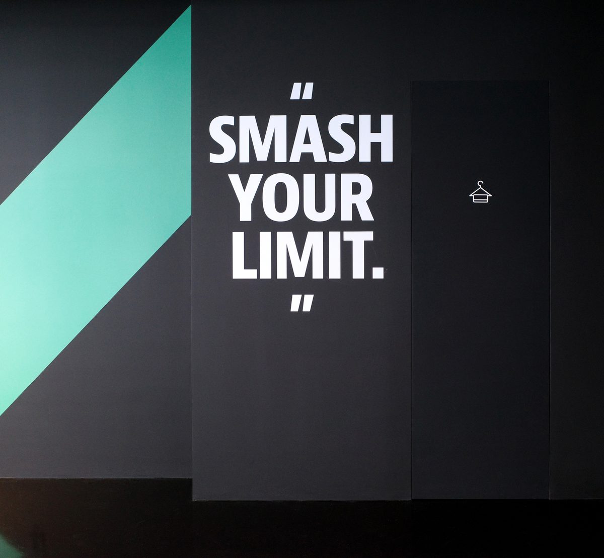
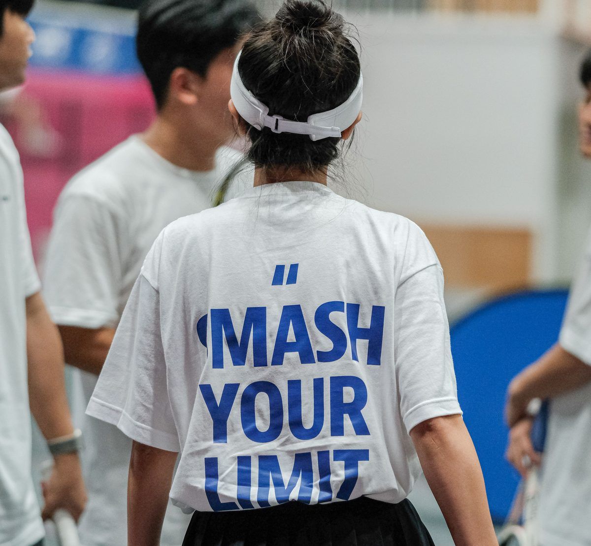
Our slogan is a wordmark too. Always use it with the logo, and never retype or change it.
ART DIRECTION
Show the court and the people
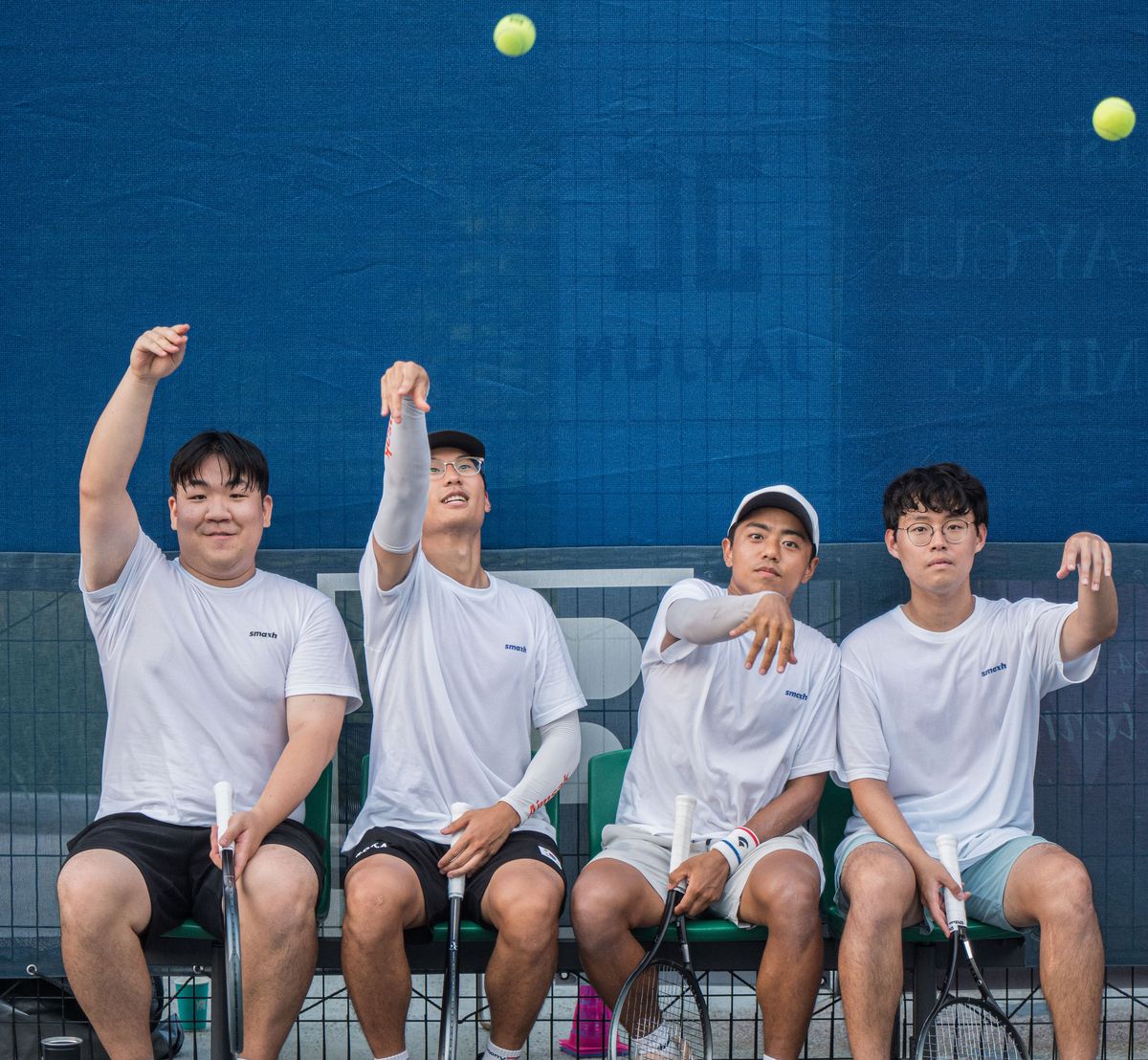
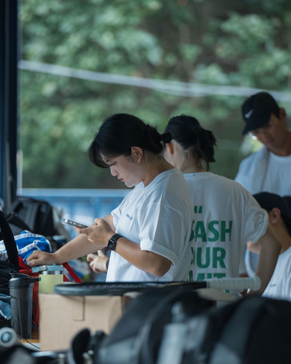
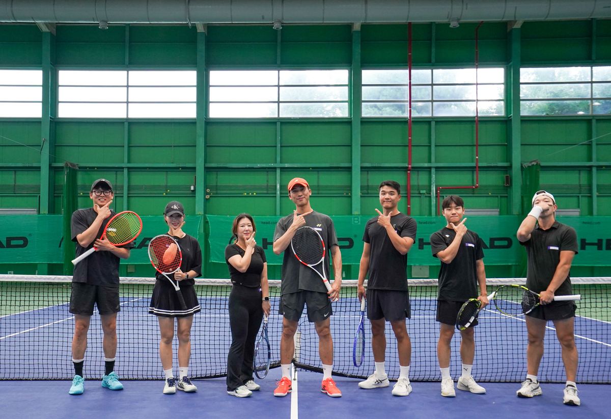
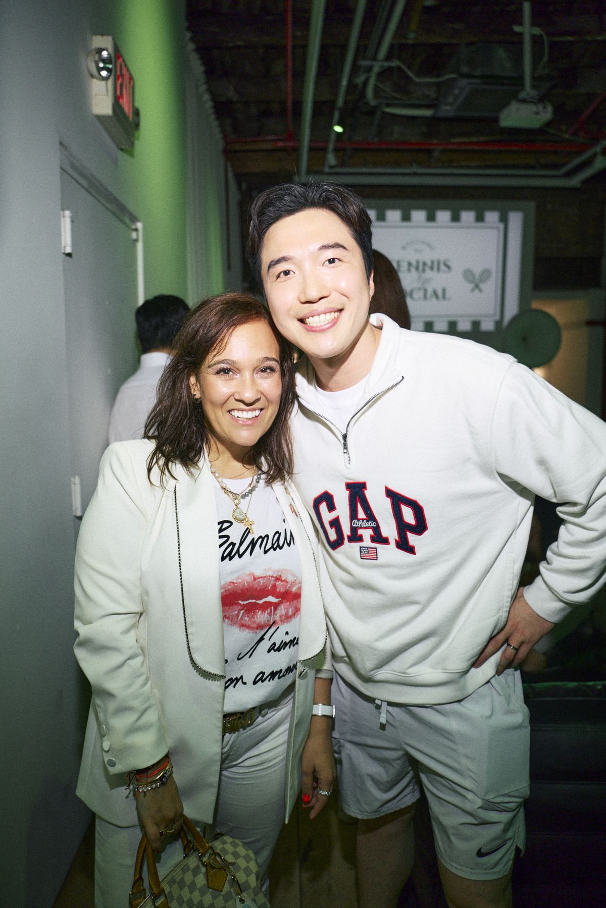
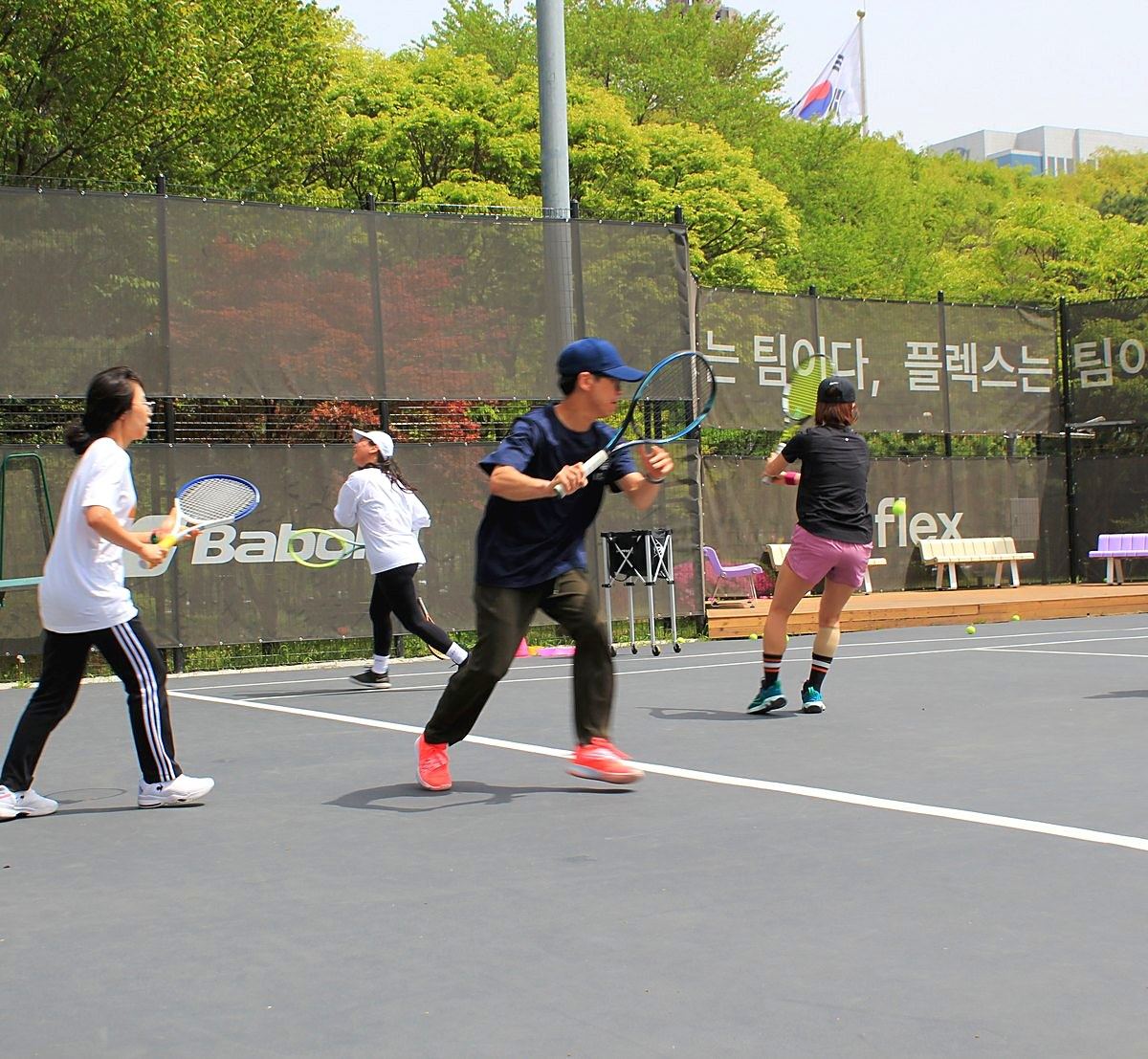
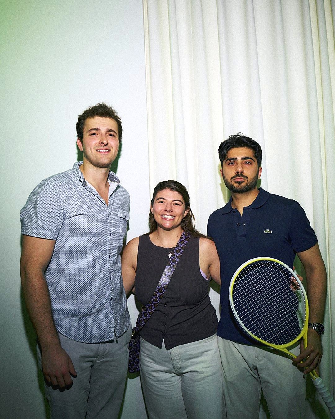
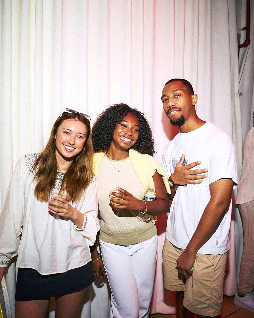
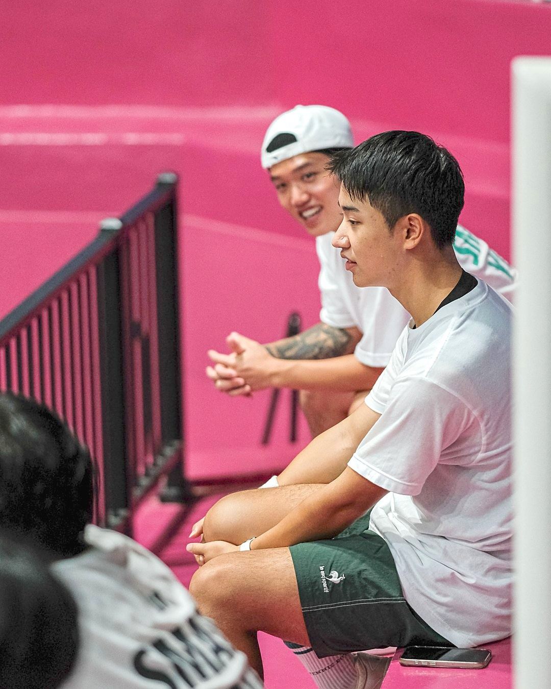
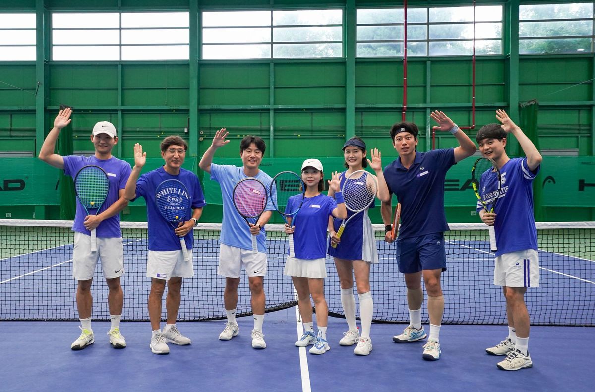
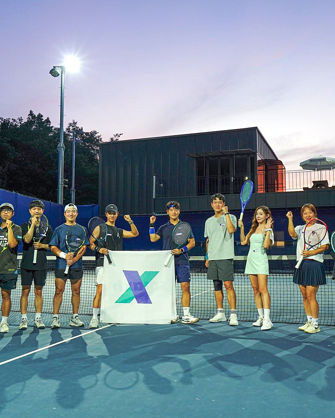
Real moments over staged ones. Use 13:12 photos that show the court and at least two players.
LOOKBOOK
smaxh, on court and off
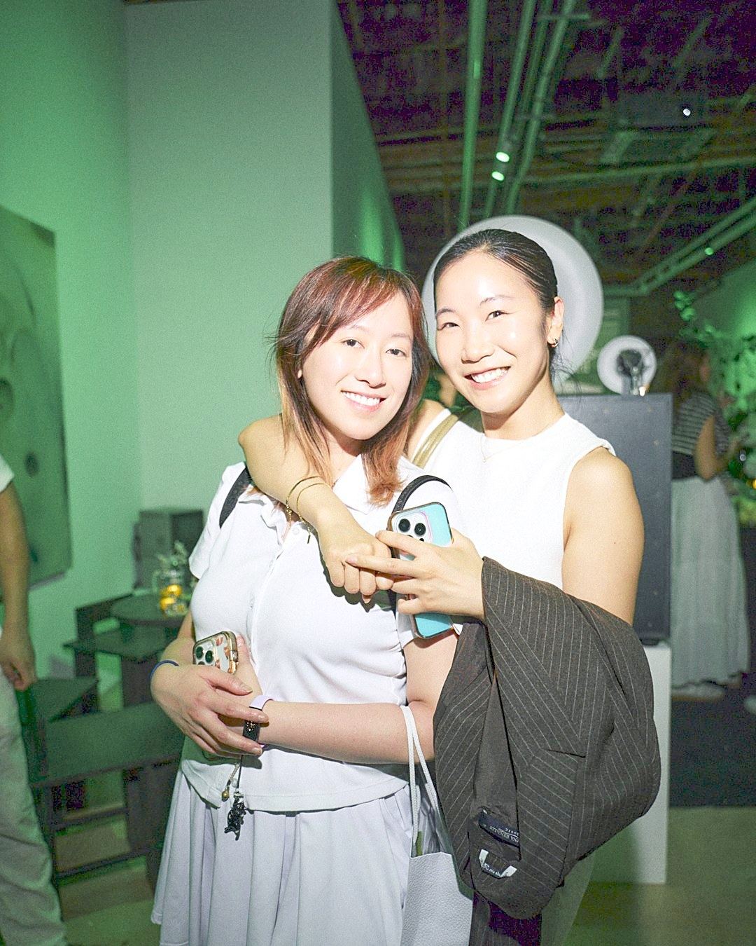
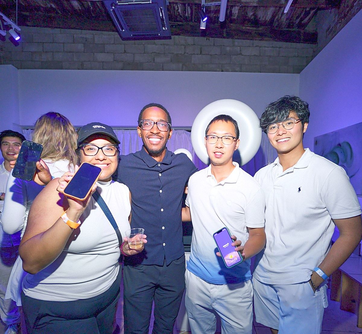
Real moments from people who met through smaxh in Seoul and New York.
TEAM X
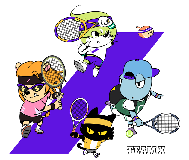
Five friends, TEAM X
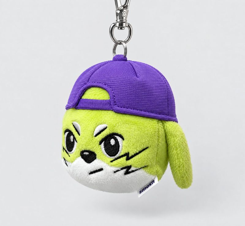
Sasha, MJ, ACE, XO and Harper. Five friends who turn their quirks into strengths. They make smaxh friendlier in the app and on merch.
XO
XO has been in our match chats
for four years.
Hello. On my way. Good game. XO says it for you in every smaxh match chat.
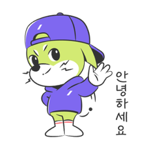
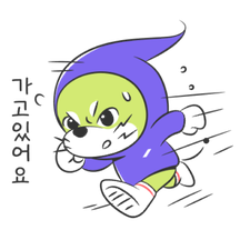


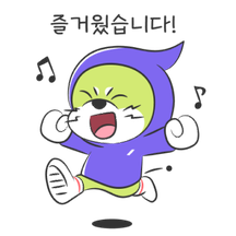
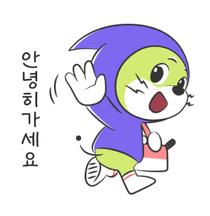
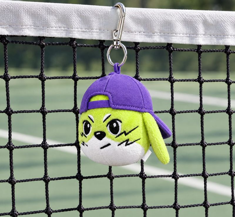
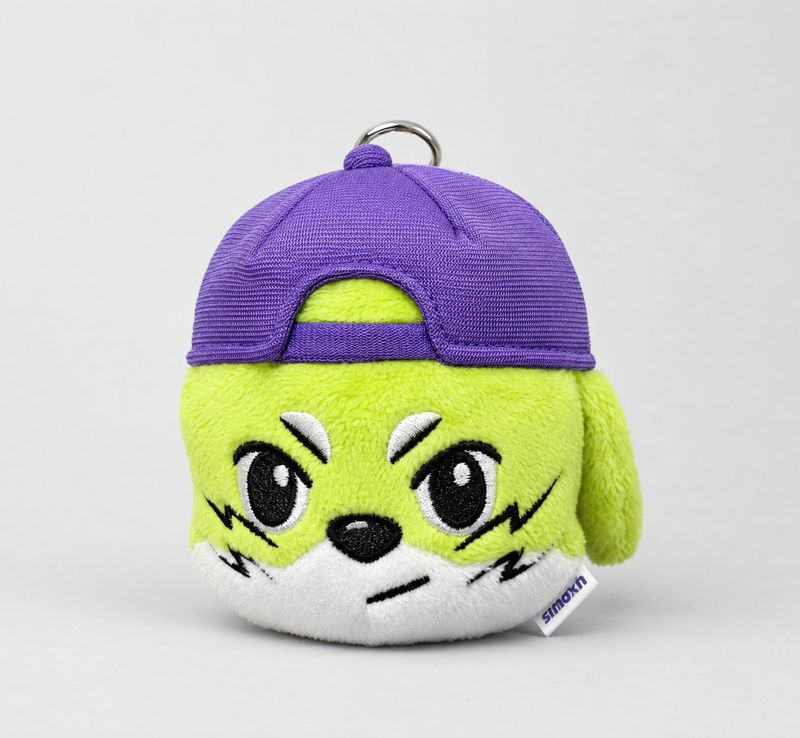
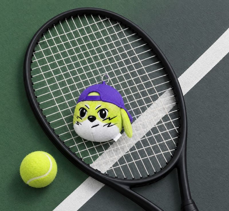
smaxh originals · XO keyring
DOWNLOADS
Brand downloads
All original files live in one place, our Press page.